
Beyond ONE
Lead Product Designer
I took an undocumented, fragmented plan card, the single most used component across 4 telecom brands in two markets, and rebuilt it as a scalable, multi-brand, bidirectional component system using Claude AI and Figma MCP. The result: 19 building blocks, 4 card sets, full RTL support, and a component architecture that lets any designer configure a plan card in seconds instead of building one from scratch for each brand. Phew!
So I turned Claude on the part every one of those four brands had quietly skipped for years: writing down how the component actually works. Building and documenting turned out to be two very different jobs for AI: one took constant correction, while the other just worked. Here's the whole story, including the parts that were more work than I expected.
One design system for four brands. Built for consistency, speed and creative freedom.








THE PROBLEM
Before: four brands, four messes
Before January 2025, Beyond ONE didn't have a design system. It had four.
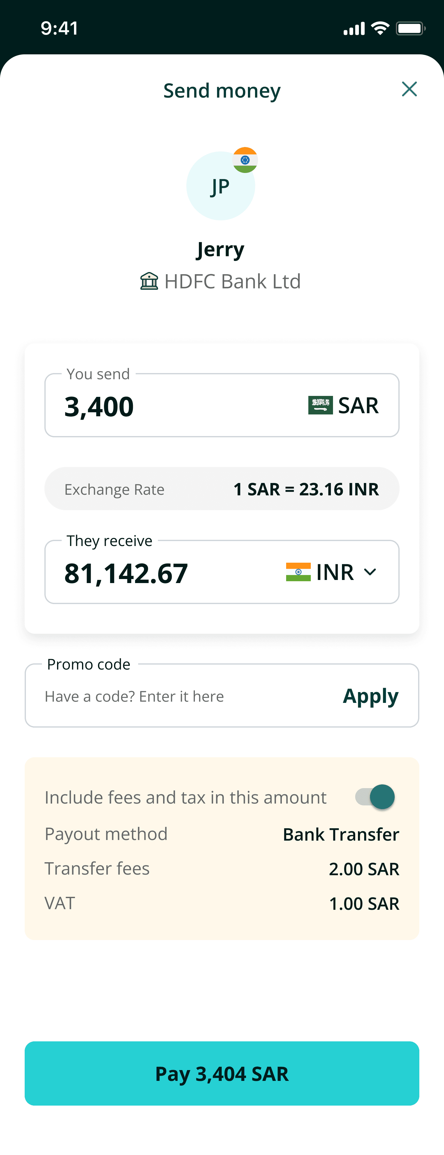
Virgin Mobile (GCC and LATAM), Virgin Connect Roam, Friendi Pay, and Friendi Mobile each maintained their own components inside their own Figma files. Color was themable through styles. Text styles existed. Spacing, elevation, and border radii were hardcoded. There were no variables, no tokens, and critically no documentation. Nothing telling a designer why a decision was made, what a component could or couldn't do, or what would break if they changed it.
Every new journey, promotion, or market meant building a variation of the same components from scratch. A manual, time-intensive process repeated four times over for work that should have happened once.

Virgin Connect Roam - Design System - Components
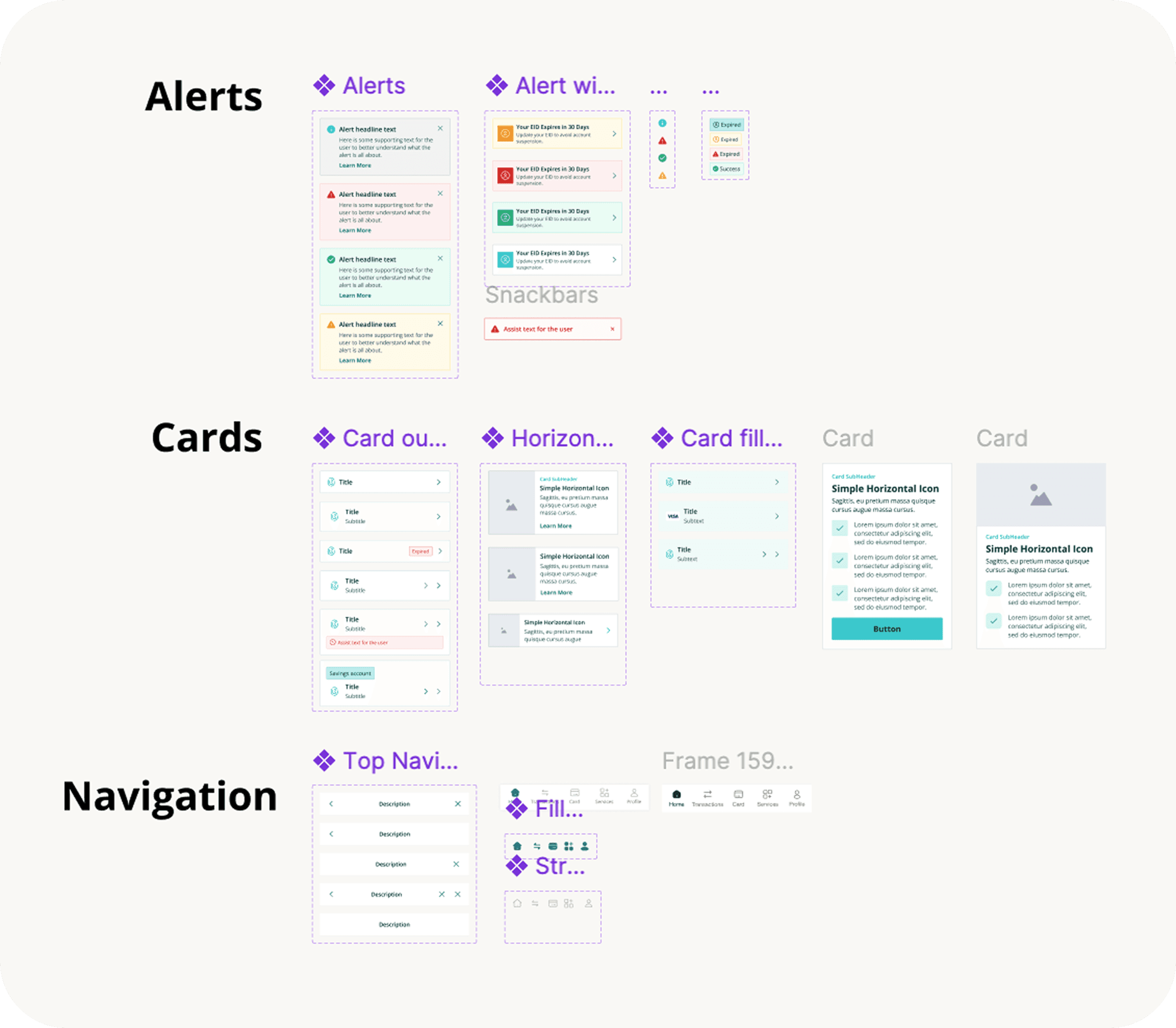
Friendi Mobile - Design System - Components
The result was predictable. Product inconsistency, components lacking accessibility, increased engineering effort, and meetings requested to explain designs due to lack of documentation. New team members needed a 30-minute walkthrough to onboard per product. And too often, what landed in staging didn't match what was in Figma at all. We weren't maintaining four design systems. We were maintaining four sources of disagreement, held together by the UI/UXs team knowledge.
THE SOLUTION
Building the core design system
Three designers. Four months. One component library; one source of truth. One token architecture. Four brand themes powered by swappable appearance tokens. Same components, different visual identities. RTL baked into the component structure from day one, not bolted on after.
Token architecture
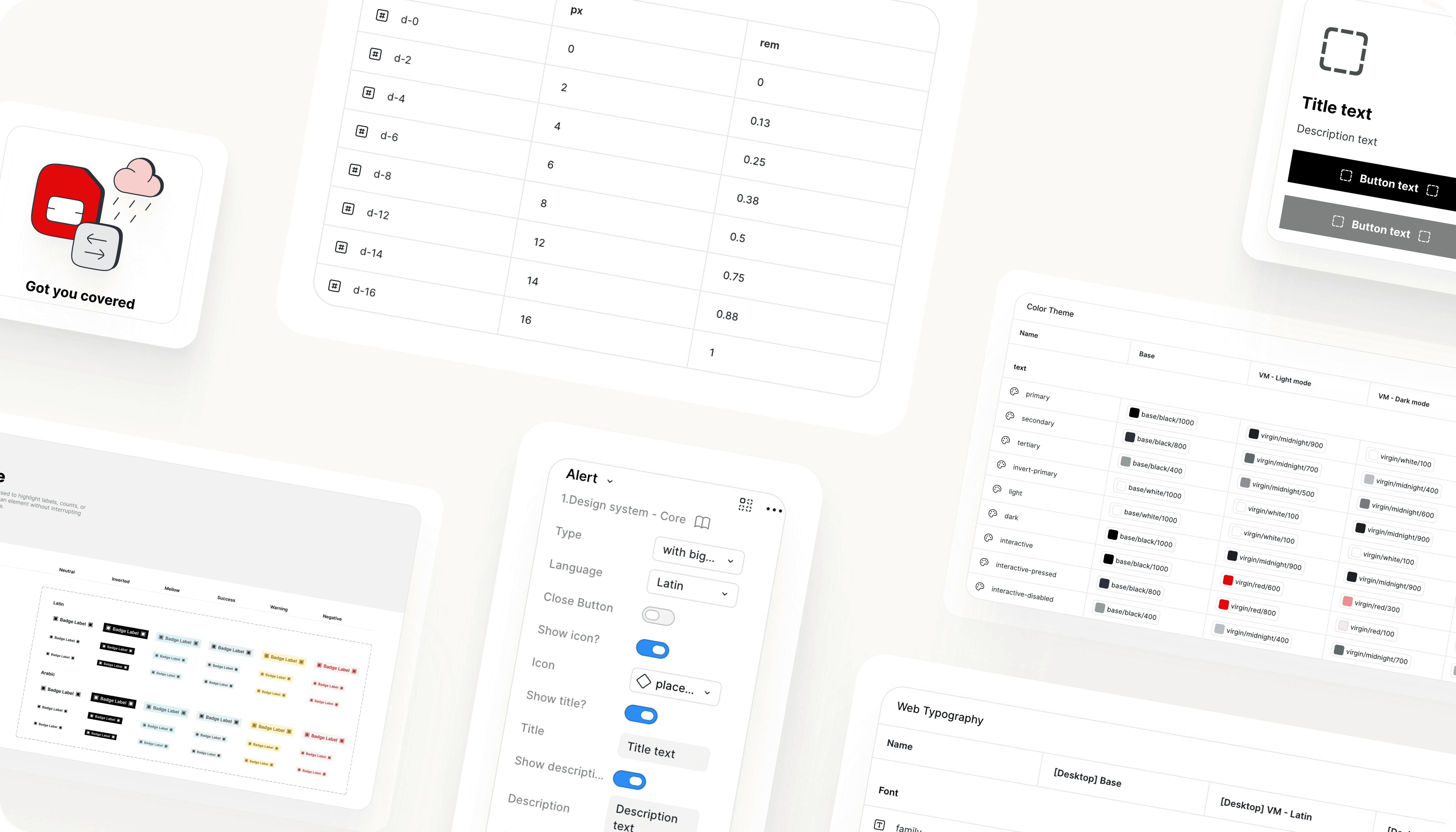
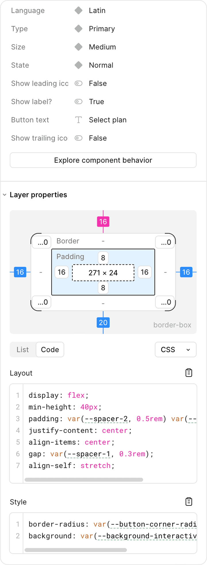
We needed every visual property in variables, not values. The naming debate nearly stalled us. Engineering wanted Material Design conventions. We pushed back. We don't work with Material's mental model, and forcing designers to learn a naming system that doesn't match their files creates the same translation gap we were trying to eliminate. So, we landed on semantic naming: text/primary, background/interactive, d-2. Language both teams could read without a glossary!

But one component stayed behind.
Not everything went into V1. Illustration systems, motion tokens, complex and brand-specific components. The plan card, for example, the single most used, revenue-critical component in the ecosystem across three brands was something I wanted to bring into the core. It was too complex, tangled in brand-specific logic, and undocumented to migrate in the initial push. New markets launching meant rebuilding it from scratch each time because every brand had its own version, quirks and gaps.
The plan card is the first thing a customer sees when choosing a plan. It drives discovery, conversions, revenue. If it doesn't scale, the experience breaks for users, engineering, and for every market we launch next. We needed one card, built once, built right.
THE COMPONENT
The plan card
At first glance, a card seems straightforward, right? A title, price, a list of features, a button. Easy, right? Not quite. Not at Beyond ONE.
The goal was simple but hard to do: one plan card that works for every Virgin and Friendi product. Before rebuilding anything, I needed to understand what actually existed. How the different versions were structured, what was tokenized, what was hardcoded, where they quietly diverged.
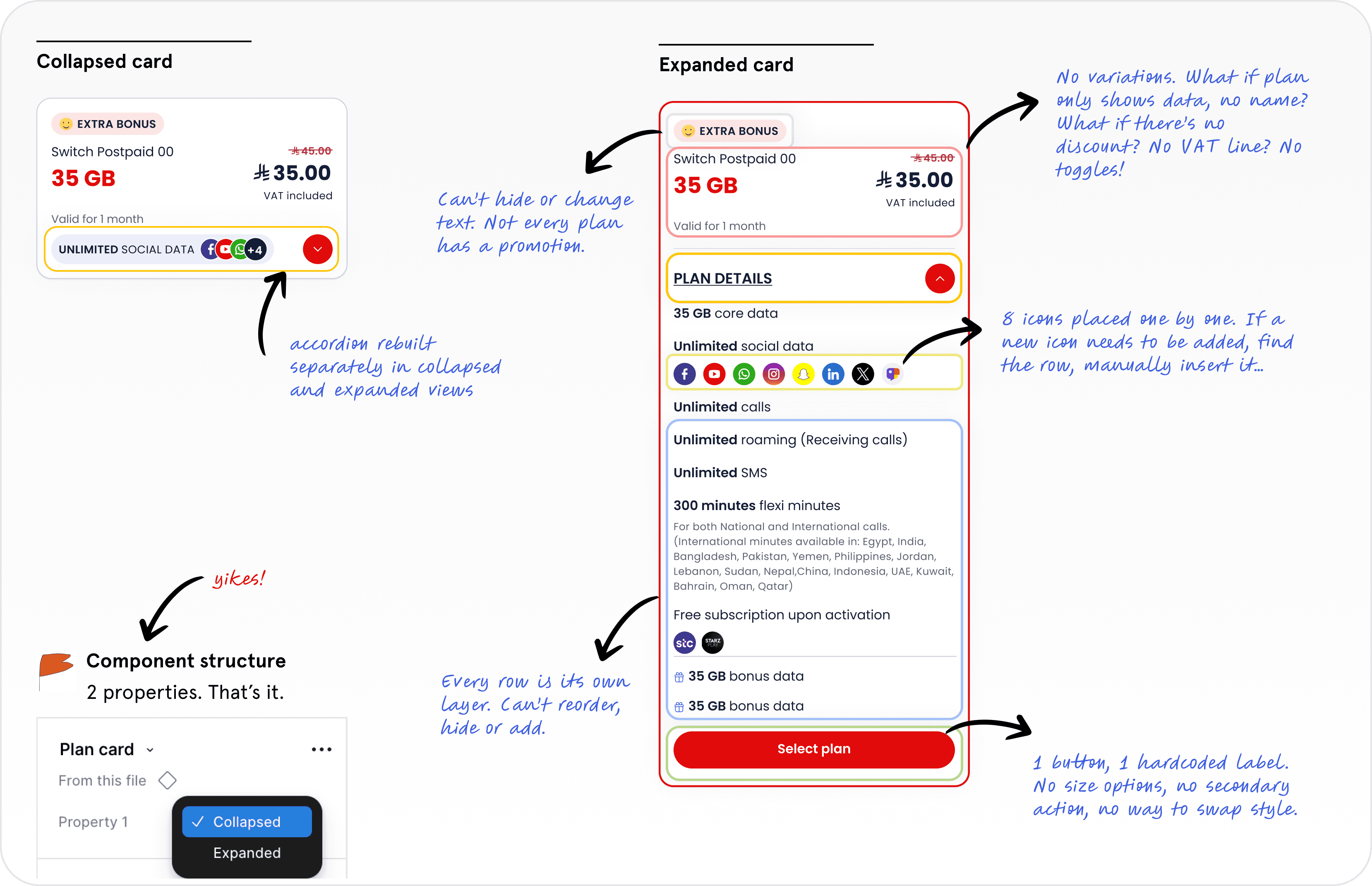
I used Claude AI to run a structural audit on the plan cards across KSA and LATAM. Not a visual review but a layer by layer inspection, every node, every variable binding, every text string, every nested instance.

What came back confirmed the scale of the problem. Two exposed properties for the entire component - no way to add or reorder line items without manually rebuilding, one hardcoded CTA with no secondary action, no way to style variants without detaching instances.
The approach
After the audit, the path was clear: this wasn't a redesign problem. It was an architecture problem. The card needed to be decomposed into reusable building blocks, each with its own properties, and then reassembled into a card that could serve every brand, every market, and both reading directions, without exploding into hundreds of variants.
I used Claude AI with Figma's MCP integration to do it. Not as a design tool, as a build partner. The workflow was simple. I made the architectural decisions. AI executed them at scale.



Decisions I made
Started with the anatomy
Before touching any tool, I mapped out the component into 5 building blocks, each responsible for one job: plan attribute, badges, heading, list items, CTA. The old card was a monolithic layer tree. The new one is a composition of independent, swappable parts.

Every block = independent properties
The old card had two properties for the entire component. The new one distributes control across the building blocks so a designer can change a price format or add a badge without touching anything else
Every block has a slot component
A placeholder that accepts any component through instance swap. New use case in 6 months? Swap it in. No detaching. The system doesn't break.

Seperate RTL sets, not direction variant
RTL isn't just flipping the layout. It's adapting the interface to how Arabic-speaking users scan and interact. We buily complete Arabic cards, authored natively for RTL. Typography moved from Tajawal to IBM Plex Sans Arabic. Arabic is the primary market for GCC. The experience should feel native, not adapted.

WHAT AI BUILT
19 blocks, and a lot of babysitting
19 building blocks, from scratch, correctly bound to variables, correctly wired for auto-layout and properties. What would have taken a team several hours of assembly took one designer a couple of hours of review plus something I didn't put in the original plan: roughly half a day of back-and-forth correcting AI for bypassing the design system it was supposed to be built from.
Left unsupervised, Claude kept reaching for the fastest path instead of the correct one. It built brand-new CTAs instead of instancing the DS button component already sitting in the same file. It skipped the instance-swap placeholders I'd designed for badge icons and drew static icons in their place. It created new chip components instead of reusing the one already in the library. None of it was wrong exactly. It looked right at a glance but every instance was a small, quiet fork of the system I was trying to unify in the first place.
Catching this meant checking every block against the actual component library, not just against the spec, and redirecting Claude back to what already existed instead of what it could generate. It's the same failure mode, at component scale, that produced four separate plan cards to begin with: when the right piece isn't obvious or in front of you, you build a new one instead of reusing the one that's already there.
WHERE AI ACTUALLY PAID OFF
The documentation gap AI closes
Here's the part I almost skipped, and shouldn't have.
Nineteen well-built building blocks with zero documentation is just a more elegant version of the original problem. Nobody outside our head knew what "WidgetPlanAttribute" meant, why the trail toggle worked the way it did, or what to do if a 5th badge needed to fit. I'd fixed the structure and quietly recreated the tribal-knowledge dependency in the same move.
So I pointed Claude at the documentation, using the same specification the audit had already produced; every property, every variable binding, every RTL rule. And it was a completely different experience from building.
The difference came down to what Claude was allowed to invent. When I asked it to build components, it had to make small judgment calls constantly, which existing piece to reach for, whether to reuse or create and that's exactly where it went off script. When I asked it to document, there was nothing left to invent. The spec was already the ground truth. Claude's job was to describe it accurately, not decide anything. Usage guidelines, property definitions in plain language, do/don't rules, accessibility and RTL notes for all 19 blocks came back needing edits for tone and clarity, not corrections for accuracy. A fraction of the correction time building had cost me.

Style tab: component types, the rule for when to use each one, and a live instance, not a mockup.
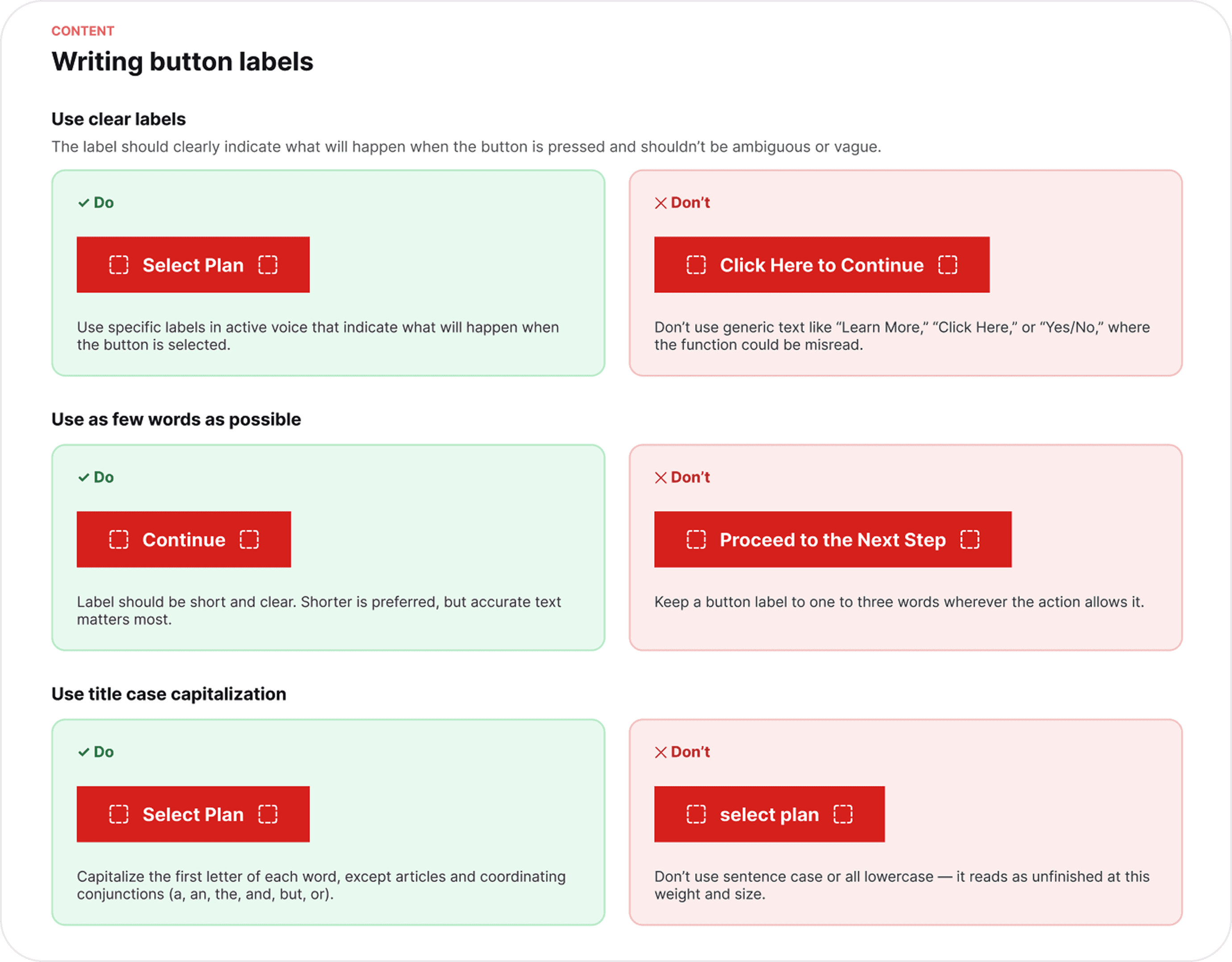
Usage and Behavior tab: the do/don't rules for writing the label itself, the same layer that used to live only in a designer's head.
That's the real lesson from this project, more than the component itself: AI saved me real hours, but only for documentation. The design team gets far less questions on Teams or requests for meetings. Clear documentation has bridged the gap between handoff and delivery.
Documentation turned out to matter far more. An undocumented component doesn't stay untouched. Someone, or something, eventually needs it and can't find it, so they build a version of their own. That's exactly how we ended up with four separate plan cards in the first place, and it's the same instinct I watched AI fall into mid-build when the right component wasn't obvious enough to find.
THE COMPONENT
Impact
At first glance, a plan card seems straightforward… not quite. We measure the design system the same way for every component across three buckets
Reuse and cost
Number of components used and cost of creation
Team performance
Number of new components shipped and days to design and build them
User impact
User satisfaction and efficiency
Design-dev handoff time
-40%
WCAG non-compliance issues
-90%
New designer onboarding
Days
Not weeks…
Products using the system
100%
The pair worth remembering isn't in the stats above. AI didn't make this project free. It made the build faster but noisier, and the documentation faster and quieter. And knowing which was which going in would've saved me the half-day I spent catching a Claude-built CTA that should've been an instance.
LEARNINGS
Key takeaways

Collab drives adoption
A system nobody uses is a file. The pain felt by all teams, inconsistencies, time-to-market, is what drove this project in full speed.

Hot take: AI needs a leash when it's deciding, not when it's describing
Building required Claude to choose between reusing and creating, constantly, and it defaulted to creating more often than I expected: new CTAs, new chips, skipped instance swaps. Documentation required no choices at all, just accurate description of decisions I'd already made, and it barely needed correcting.

Undocumented components get rebuilt, not reused
This is the exact failure mode that produced four separate plan cards in the first place, and the same instinct I caught AI falling into mid-build when the right component wasn't documented clearly enough to find.
Accessibility and brand consistency are non-negotiable
Not stretch goals, not phase two. The system either meets the bar on day one or it teaches every team that ships with it that these things are optional.

Configurable components enable scalibility
Slot variants, distributed properties, token-driven theming. The plan card has 19 building blocks, but the real deliverable is an architecture that absorbs change without needing to be rethought and now, for the first time, a set of docs that explains why.