

Beyond ONE
Lead Product Designer
Friendi Pay is a remittance wallet built on FRiENDi Mobile's base of 750,000 users. Its users are blue collar workers sending money home to India, Pakistan, the Philippines, and Egypt, mostly through exchange houses: walk in shops where you hand over cash, get a paper receipt, and know it's done. Digital transfers cost 40 to 50% less in fees, but the exchange house kept winning. It offered proof, a person to ask, and certainty the money arrived. Our app offered none of the three.
I reframed the project from a visual refresh to a trust problem, redesigned how money is sent, remembered, and proven, and built the measurement framework that told us whether it worked.
I chose to make the app prove money moved, over making it feel modern.
of new users complete a first transfer. Up from 31%


Every transfer is a promise kept back home

CONTEXT
Who we were designing for
Blue collar workers in the Gulf send 60 to 80% of their monthly income home. Same amount, same person, every month. This is rent in Kerala, school fees in Lahore, groceries in Manila. The transfer is the whole reason they're here.
Their current option: exchange houses. Walk in, hand over cash, a person handles it, you get a stamped receipt, you leave knowing it's done. Nearly 60% of blue collar workers in Gulf studies report hesitation about using apps instead, citing confusing interfaces, perceived costs, and having no one to ask.
DISCOVERY
What the audit and research told us
Before designing anything, I did two things. I ran a transfer through our own product start to finish. Then I went through the alternatives and some benchmarks: the exchange house counter, Western Union, Wise, Revolut, and STC Pay. I was looking at two things: what do blue collar workers actually compare us to, and what does great look like globally?
What the product did well. Exchange rates on the home screen. Receiver side amounts visible. Saved contacts. The information layer was solid. This was not a broken app.
What the product couldn't answer. Three questions every worker brings to a money transfer: Did it go through? Where is it now? Will it work the same way next month? The app had no answer for any of them. After you sent money, the confirmation screen said "processing" and nothing else. Then the transfer disappeared into a transaction list that showed a name, a date, and a minus sign. No status. No destination. No proof.
What the research added. Our UX researcher ran fieldwork in Oman at the same time. The finding that changed the project: workers could use digital apps. They chose the exchange house anyway, because it gave them three things no app matched. A receipt. A person. Certainty.
THE PROBLEM
Every screen asked for trust. No screen earned it.
Adding a beneficiary was a looooot of work
Adding a receiver meant 13 fields. All of it stacked on top of the IBAN, which already identifies the bank. These are details a user calls home to collect. Every extra field is a place to make a mistake. We built 13.


It remembered the person, not the ritual
Saved receivers existed. And yet every transfer started from scratch, amount, method, details, by users who send the same amount to the same person like clockwork.
Sending ended with one word
After the money left, the confirmation screen said, "processing." Not when, not what happens next. Not what to do if something goes wrong. The single most anxious moment in the product.


Then the transfer disappeared
It sank into the list as a name, a date, and a minus sign. No status, no destination, no answer to the only question that matters: did she get it? The app's response was a permanent card on the home screen: "Facing any problems? Customer Support." The interface outsourced its own job.

THE INSIGHT
Queuing wins on trust and loses on price.
Exchange house fees are higher. Digital channels cost 40 to 50% less across every major corridor (India, Pakistan, Egypt, Philiipines). Price wasn't moving anyone. Trust was the bottleneck. The competitive walkthrough surfaced one more thing most players had skipped: an agent option. Cash in through a person, onto digital channels. For a workforce paid in cash and at home with counters, this was the missing entry point.
How might a digital wallet earn the trust a worker gives to a queue, so its real advantages finally get a hearing?

01
Prove it, don't polish it
Show me the money moved
02
Say the rules out loud
Limit and state steps early. Discovered late, they are traps
03
Design for the ritual
Same person, same amount, every month
04
Bridge the physical world
Cash isn't the enemy. Its how most of our users get paid
WHAT I DESIGNED
One decision: build trust into the structure
Every mechanism the exchange house uses to earn trust had to exist inside the app. Not as copy. As structure. Five expressions, each shown as a before and after.
The receipt
Rebuilt the confirmation screen as the thing the exchange house hands you. Amount, confirmed status in green, what happens next, payment and exchange details. Itemized, timestamped, keepable.


A transaction list
Every transfer now shows its state (Paid, In progress, Failed) and how the money arrives (bank, wallet, cash pickup). A user checking on 400 SAR needs an answer, not a minus sign, so failure became a visible state with a next step, not a silent absence


The beneficiary form
Adding a receiver meant 13 fields of banking jargon a user had to phone home to collect. Every extra field was a place to get stuck or give up. I cut it to what the transfer actually needs: IBAN, bank name, branch code, name, nationality. Six fields, asked once.


Repeat transfer
The old product saved the person. The new one saves the transfer. Repeat Transfer remembers everything: Sis, SAR 1,200, same bank as last month. The monthly ritual became one tap and a confirmation. This is the pattern of blue collar remittance.

The agent bridge
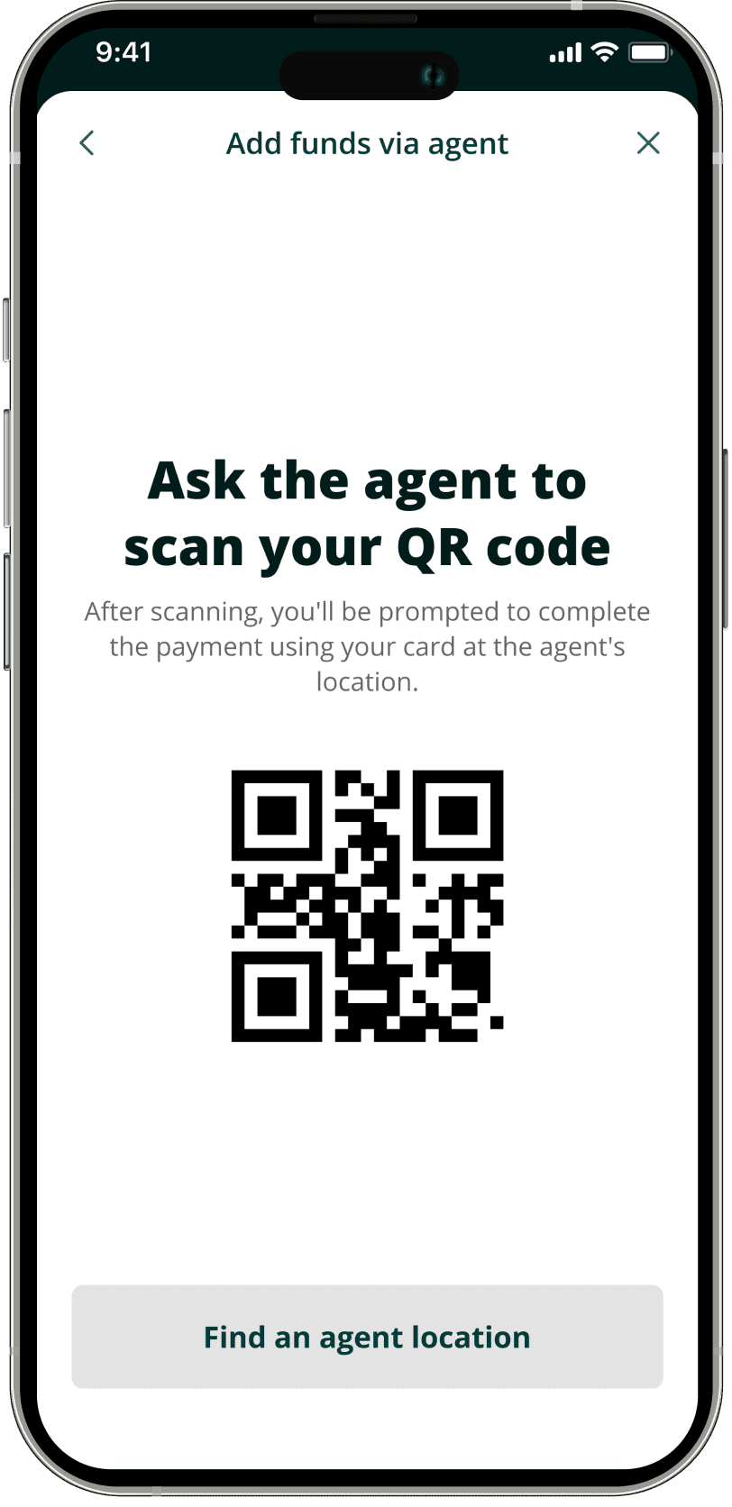
Hand cash to a Friendi Agent and it lands in your wallet. The counter's most familiar gesture now feeds the digital product instead of competing with it. Next to it, a vault for three saved cards for users ready to go fully digital. The agent is the bridge

HOW I MEASURED IT
The metric tree
We built the measurement framework. One North Star, four branches. Every design decision tied to a number that could prove it wrong.
North Star: Total successful remittances per month.
Is the money going through?
Transfer success vs. failure by corridor
Failed transfers that become support calls
How often users check the app after sending
Are they sending?
Which form field causes drop off?
First transfer: real money or test amount
Are they coming back?
30 day repeat rate
Same receiver, same amount
Is the bridge working?
Agent users who go fully digital within 90 days
Agent vs card user retention
Funding method shift over time
WHERE I GOT IT WRONG
The agent option nearly died in review.
Pushback: an agent flow sends users out of the app. The whole project was about building a digital habit. Every agent visit is a transfer we didn't digitize. The objection was correct. Also incomplete.
The research showed agents aren't a leak. They're how the funnel starts. Workers who live in cash don't convert because we insist. They convert across a bridge they can walk back over. We shipped it and the metric tree holds it accountable: funding method split and agent vs card retention tell us if the bridge is working or leaking.
WHATS NEXT
The receipt was the beginning, not the end
A delivery promise. "Arrives by [time]." The counter tells you when. So should we. Status updates that come to you. A notification when a transfer moves. Nobody should have to open an app to check. A shareable receipt. Send confirmation to family on WhatsApp. The slip's real job was always showing someone else.
IMPACT
Four questions
90 days after Oman launch
IS THE MONEY GOING THROUGH?
32%
"Where is my money" tickets down from 48%
Status checks down 31%. Trusted products get checked less.
ARE THEY SENDING?
68%
Complete a first transfer up from 31%
The typical transfer is 380 SAR. Trusting with real money from Day 1
ARE THEY COMING BACK?
61%
Repeat within 30 days up from 40%
50% of the transfers start from repeat. The ritual moved in.
IS THE BRIDGE WORKING?
38%
Go fully digital within 90 days of agent funded users
Agent users retain on par with everyone else.
REFLECTIONS
What i’d carry to the next product
Trust has an order of operations
Better prices moved nothing until the trust deficit was resolved.
The best trust metrics go down
Status checks, anxious tickets, compulsive refreshes. When a product is trusted, people stop watching it. Measure absence, not just activity.
Don't always fight the system users trust. Bridge it
The exchange house was our on ramp, not our enemy. Meeting users inside their current behavior converts better than insisting they leave it.
A brief is a hypothesis
The assignment said old UI. The research said unaccountable product. Holding the brief loosely is the working style this project made permanent.