

Beyond ONE
Lead Product Designer
Virgin Connect Roam solves a real travel problem: staying connected abroad without roaming costs, with reliable coverage even in remote destinations. And eSIMS carry a promise. A fully digital experience; no queuing at kiosks, no swapping plastic cards on the plane… or at the airport.. or in the cab!
At VCR, that promise broke right after payment. Getting connected (the entire point of the product) took more effort than the plastic it replaced. People trust "Virgin" and the journey made them doubt a purchase they'd already made.
I redesigned the experience at the platform level, not just screen tweaks but strategy: simplify decision-making and guide users from intent to purchase to install in one continous flow. The result was a more intuitive, accessible, and conversion-optimized experience.
90s
from 8.5+ min; checkout to installed eSIM
91%
Activation within 7 days, up from 58%
3.5%
Refund rate down from 23% previously
88%
Android install completion from 45%
THE STARTING POINT
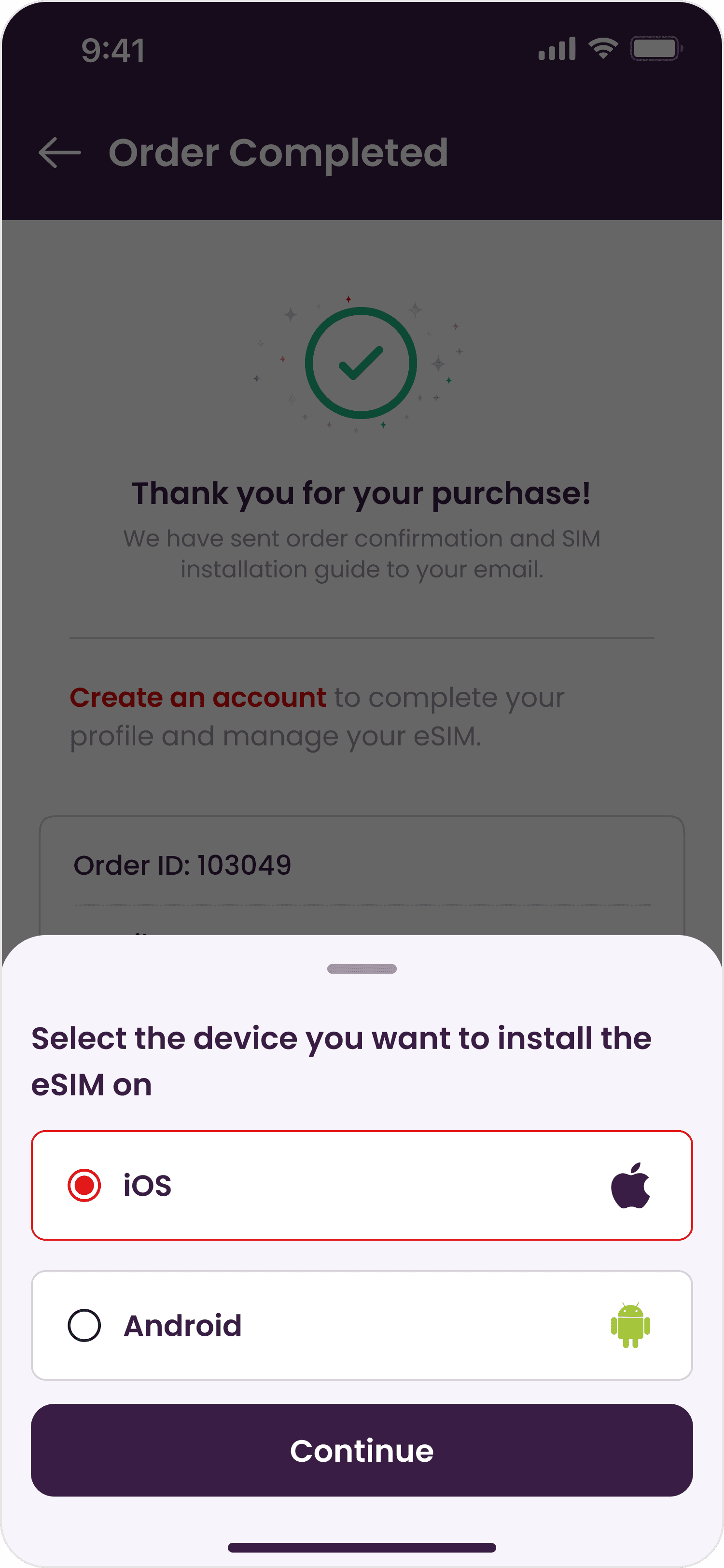
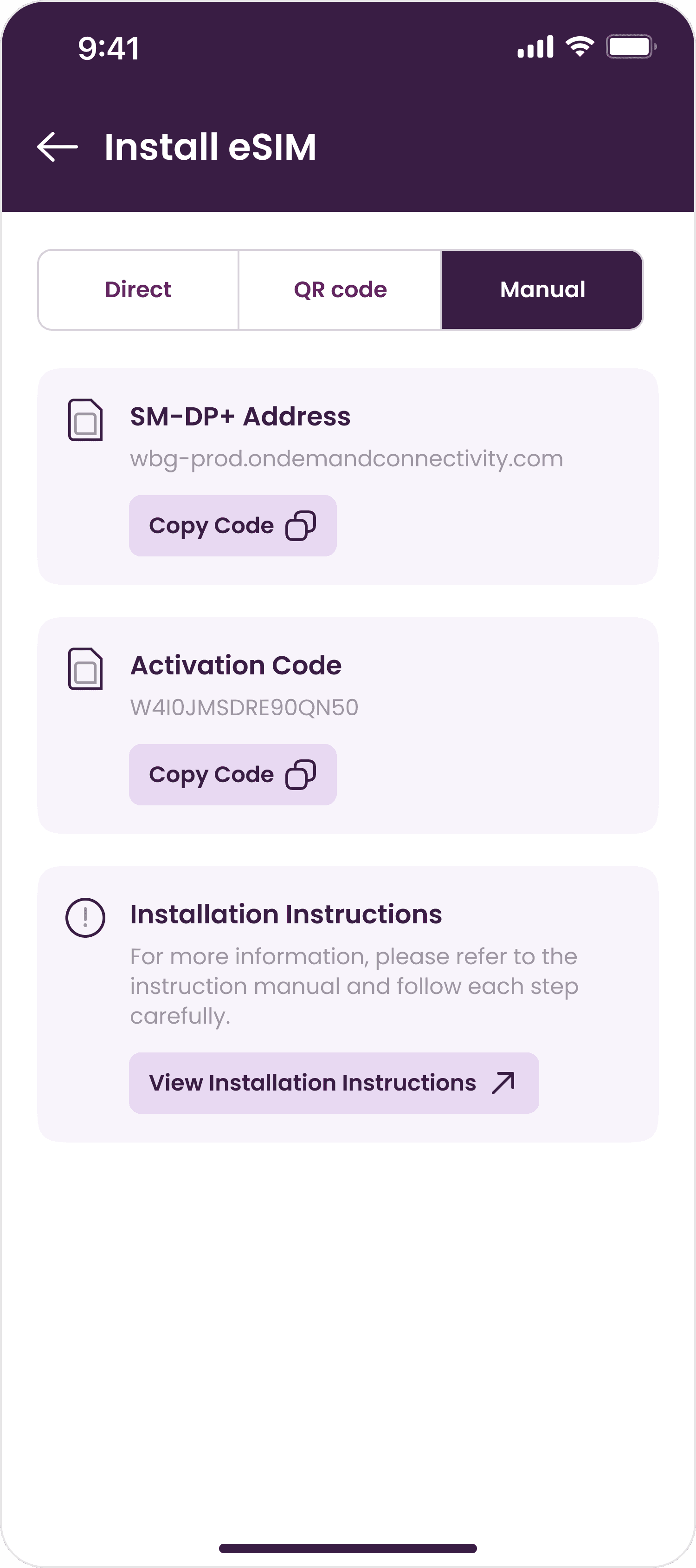
We were great at selling eSIMs… just terrible at what happened next: seven decisions across five screens stood between payment and working data.

Checkout: the interruptions




THE SIGNAL
Last Christmas I flew to London and bought our eSIM at the airport. The install button never showed up. I had three teammates on Slack who all sent me the direct link. It took an insider and backup to get online. If the person who designs this product needs three colleagues to install it, what chance does anyone else have?

The post-purchase journey didn't need much noticing. It needed a rescue. So the hunt became a full audit from activation flows, revenue leakage, churn trends, to drop-off points in partnership with the Product Analytics team. The numbers were blunt:
8min
to install. Sometimes more…
58%
Activation of eSIM within 7 days
23%
Refund rate ≠ network issues. "Where is my eSIM"
88%
Android install completion from 45%
Framed as UX, this was a bad flow. Framed at a platform level, it was three compounding risks
A growth risk: customers who never activate never come back
An efficiency risk: installation was our #1 support ticket category.
An adoption risk: Android users, half the market, stuck with the hardest path.
Every risk traced to one root: the product knew nothing about the user at the moment of purchase. And we'd done that to ourselves. Sign-in had existed once but guest checkout replaced it to speed up conversion. The number we watched went up. The system we weren't watching broke: with no accounts, every purchase minted a brand-new eSIM. Frequent travellers accumulated four or five eSIMs per device.
My pitch to the leadership wasn't "add accounts." It was "reverse a win." My loop is simple: catch the signal, frame the cost, prototype the fix and then ask for roadmap space. This reframe turned a UI cleanup into a journey redesign, and won the CPOs buy-in to reintroduce auth at plan selection.
RESEARCH
I benchmarked 6 leading eSIM products: Airalo, Holafly, Saily, Nomad, and X, with one question - What UX actually drives activation?
Defend the moment of peak intent
The confirmation page is treated as a conversion page: one install CTA, everything ele demoted or removed. Nothing competes with the next step.
Route by context. Never ask what you can detect
The system reads the situation - device compatibility, install state, and serves one tailored path.
Teach the settings OS won't
Leaders brief users at install time: airplane mode, data line, roaming. Failure pre-empted, not troubleshot.
Android is a first-class citizen
One-tap install on both platforms, no exceptions. Our iOS only support was roadmap gap dressed as a constraint.
RESEARCH
The framework: decide for the user, defend peak intent, pre-empt failure outside the product. Every move in the redesign traces back to one of these four. The full benchmark audit is embedded below.
THE REDESIGN
One structural change powers everything: users sign in, so the product knows who it's talking to. A dual-path architecture where returning travellers get eSIM reuse by default; new travellers get one guided path with auto-detection built in.
The compatibility check
The mid-payment popup is gone. "Choose your eSIM setup" lives before payment: a compatibility engine defaults to the eSIM that works. Want control? Change opens a sheet that speaks traveller. New eSIMs become a deliberate choice, not a confused default.


The success page
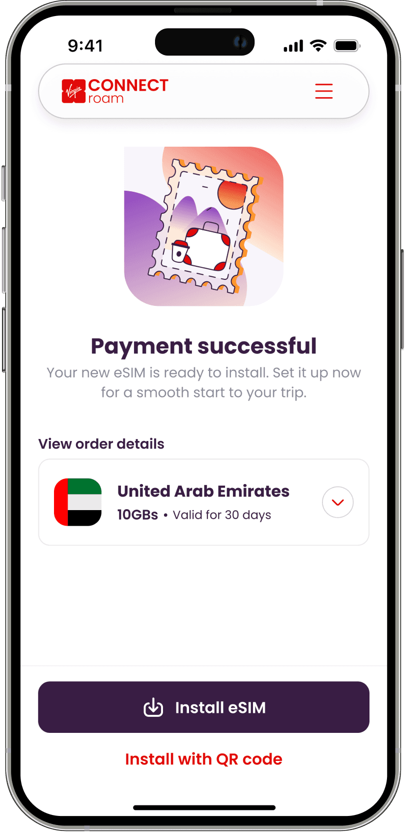
Reused an eSIM? Nothing to tap. New eSIM? One primary action: Install eSIM. Device detection is automatic, method tabs gone, flow routes to the right path. QR stays as a quiet tertiary for another device.

Android parity
We shipped direct install for Android. The gap the benchmark surfaced, taken to engineering as evidence. From a second device and hand-copied codes to the same one tap as iOS.

The roaming nudge
Post-launch, a silent killer: successful installs, no data abroad because data roaming was off. A force-close bottom sheet now walks the fix: turn on roaming, confirm, continue. The smallest screen in the release; the highest leverage.

One page, human logic
The two-layer split is gone. My eSIMs groups every plan under the eSIM it belongs to - one page, one mental model. Plain language replaces status chips. Nobody lands on an empty screen after paying. Ever again.


IMPACT
<90s
From checkout to installation. Down from 8+ min
96%
of purchased eSIM now activated within 7 days from 58%
3.5%
Refund rate. Confirming they had been install issues.
64%
Drop in installation-related support tickets
REFLECTIONS
The best decision is one the user never has to make
Every screen we improved outperformed every screen we removed
Local wins can be system losses
Guest checkout won its KPI and quietly taxed everything downstream. Watch the journey not just the step you're optimizing
Internal architecture leaks into UX unless someone stops it
The old dashboard wasn't designed poorly. It wasn't designed at all. It was inherited from the backend.
Benchmarking is leverage, not inspiration
The Android finding didn't come from a design review. It came from proving to engineering that a platform limitation was actually a roadmap gap.
Defaults need narration
Users just don't want the right outcomes. They want to see that the product got it right.