

Virgin Mobile Colombia
Lead Product Designer
In 2025, I led the end-to-end redesign of Virgin Mobile Colombia's mobile number portability (MNP) onboarding; the journey for users transferring their existing number to Virgin Mobile. What started as a UI refresh became a full product intervention: reframing the problem, rebuilding the information architecture, redesigning plan cards, introducing eSIM and fixing a conversion flow. The redesign tripled digital MNP acquisition in 90 days, the same flow was adopted for new customer acquisition and became the onboarding blueprint for GCC, Mexico and Friendi Pay.
DIGITAL ACQUISITION
3x
7.2% → 23.4% in 90 days
FLOW COMPLETION
61%
Up from 34% at baseline
eSIM ADOPTION
41%
Of new MNP activations, 60 days
NIP CS TICKETS
-67%
vs pre-launch baseline
MNP users are a high-intent segment: they've already decided to switch carriers. They just need a reason to choose Virgin Mobile over a competitor. Only 7.2% were converting digitally, the rest coming through retail stores and distributors, where agents controlled the conversation and could redirect users to any carrier at any point. We had a measurable acquisition problem and a clear hypothesis: the digital flow wasn't converting because it never showed users what they were signing up for
The brief - Modernize the MNP onboarding UI. A scoped visual refresh i.e., update the look, clean up the screens.
The measurable problem - 34% flow completion rate. 7.2% digital acquisition share. Users were dropping off before seeing the offer.




Shift acquisition digital
Moving MNP users away from agent-controlled retail channels into digital where Virgin Mobile owns the conversation

Show value before effort
Leading with the exclusive MNP offer so users know exactly what they're signing up for before committing to the process

Build the digital habit early
Getting users into the app post-purchase to drive the reactivation behaviour that makes digitally acquired customers 5× stickier.
RESEARCH
Before designing anything, I audited the existing MNP journey end to end. The problems ran deeper than the surface. Broken structure, no design system, inconsistent branding, and a flow that had never been built around what MNP users actually needed.

Outdated visuals, no design system, inconsistent tone of voice. Nothing reflected what Virgin Mobile stood for.

No hierarchy, no logical grouping, no clear entry points. Users couldn't find what they came for, so they left

8 steps of admin. Commitment before value is the fastest way to lose someone ready to convert.

17% of MNP users left because eSIM wasn't available. A product gap with a direct business cost.

THE PROBLEM
MNP users in Colombia are deal-hunters by definition, switching carriers specifically to get a better offer. They arrive with one question: "What am I getting?" The original flow never answered it. Users were asked to verify their identity and go through multiple admin steps before ever seeing the plans. This violates a basic principle of consumer psychology: people don't commit before they see the value. The rational response was to leave.
The channel you acquire someone, shapes how they behave for their entire customer lifetime. This made fixing digital MNP acquisition a retention play, not just an acquisition one.
ENTRY SCREEN
~62%
POST-VERIFICATION
Still no plan shown, why continue?
~75%
PLAN SELECTION
Effort spent, offer not worth it
~80%
Before - Commit before you see the offer
OTP + ID verification
Begin with providing info
Enter mobile number
Continue providing info without seeing value
OTP + ID verification
Keep giving info…
NIP code entry
Effort investment, offers still not shown. Commitment.
Plans shown - finally!
Too late, effort spent
Physical SIM only
User drop off - no eSIM option
Redesigned - see the offer then commit
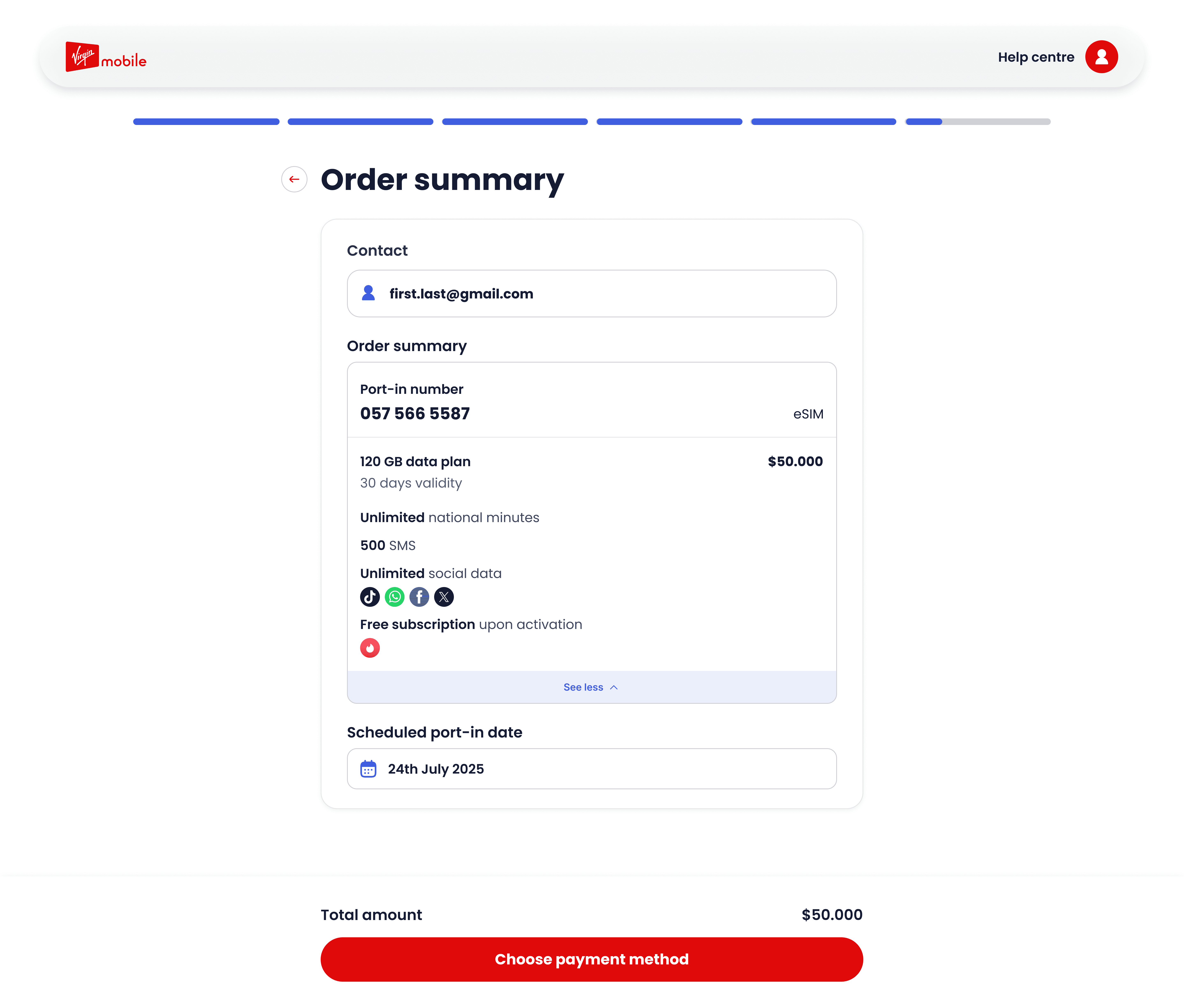
Exclusive MNP offer shown first
Hook before friction
OTP + ID verification
Informed commitment, user investing effort
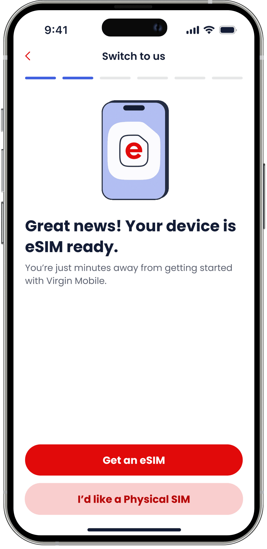
Choose eSIM or physical SIM
eSIM = instant transfer
NIP code entry
User committed to switch carriers with confidence
Order confirmation!
Download app. Web to app hand off here
DESIGN DECISIONS
01
Lead with the offer. Make every step feel worth it.
The plans moved to step one. Every screen after it became completing a purchase, not filling in a form
Trade-off: Backend complexity to preserve plan selection across steps. Worth it. Completion climbed from 34% to 61%.

02
Skip the NIP explainer. Trust the user.
MNP is routine in Colombia. The screen became action-focused - what to do, what's next
Trade-off: Skipping the explainer risks first-time users. Mitigated with clear inline guidance, not full screen

03
Pre-select the dates. Block the wrong ones.
Users picking inside the delivery window would fail the transfer. Smart default does the right thing automatically.
Outcome: Transfer date changes dropped 44%. Failed attempts dropped from 11% to 1.2%.

04
Move complexity to the right channel; not the one trying to convert.
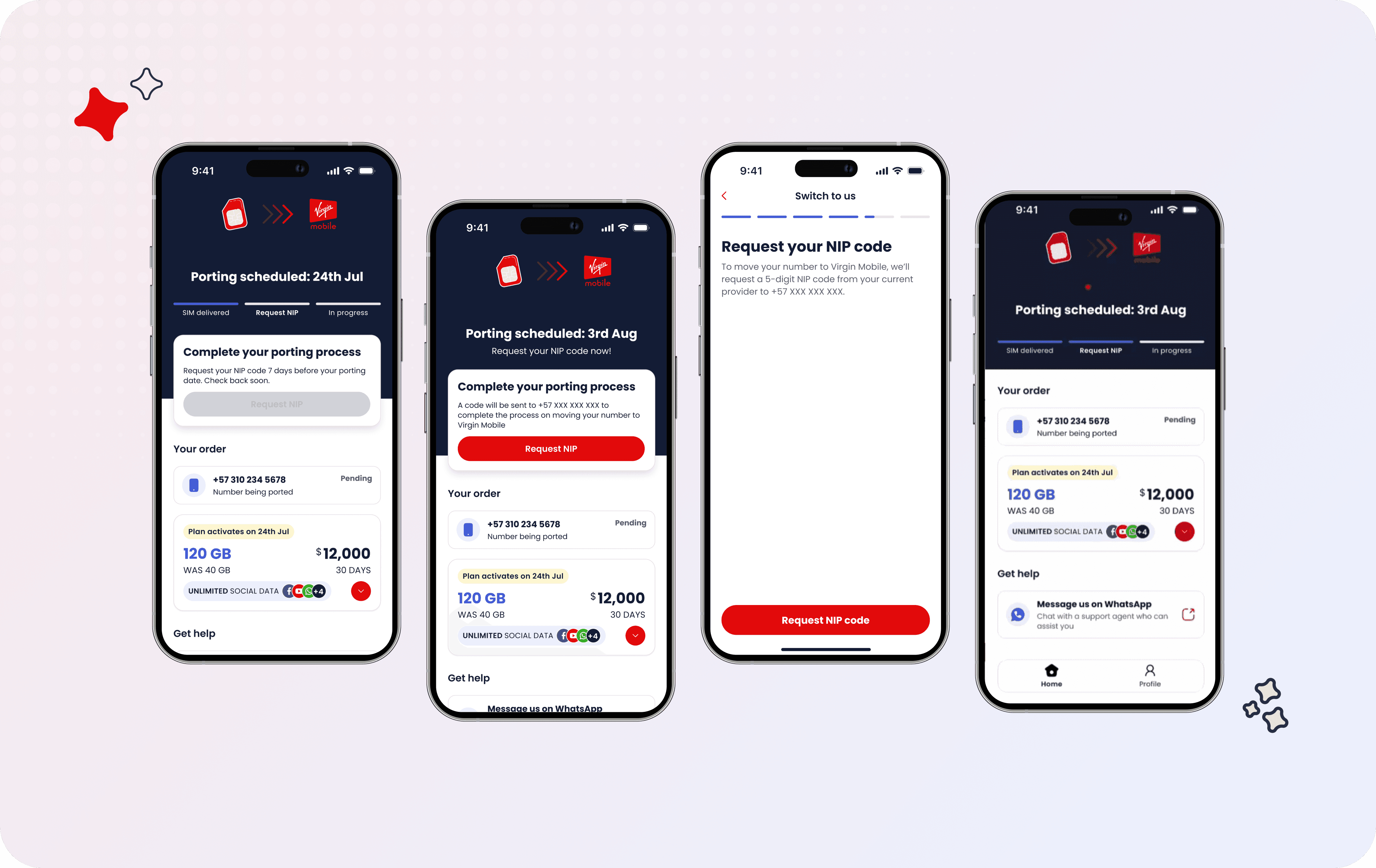
NIP expiry lives in the app, not the conversion flow. Web stays clean. App owns everything post-purchase: order tracking, NIP re-request, transfer management.
Trade-off: Requires app download. 58% of web completions downloaded the app

DESIGNING
The plan cards were the first thing users saw and they weren't built for decisions. Flat hierarchy, nothing stood out, value buried in noise. Users needed to scan, weigh value, and choose quickly. The card made all three harder. It also couldn't scale as plans evolved with promotions, eSIM compatibility, and bonus data. There was no room to absorb it without breaking.
We rebuilt it around one question: What does a user need to see to choose confidently? The redesigned card became the standardized component across Virgin Mobile Colombia, GCC, Mexico, Friendi Pay and Friendi Mobile - same structure, adapted per market.
ERROR & EMPTY STATES
The original error screens had 2 problems. The illustrations were generic, inconsistent, and disconnected from Virgin Mobile's brand. The messaging as well made difficult moments feel clinical and focused on failure rather than what comes next.
We started by defining an illustration style that felt distinctively Virgin Mobile; warmer, more characterful, consistent across every state. Then we rewrote every error and negative state with one principle: lead with reassurance, end with action. Users hitting a failed payment or expired NIP are already frustrated. The screen should therefore reduce friction, not amplify it.
THE KEY FINDING
A NIP is issued by the user's existing carrier with a limited validity window, originally 14 days, changed to 7 mid-project. The flow assumed it needed to stay valid all the way to the transfer date. Nobody had questioned this. Getting a definitive answer required triangulating across ops, legal, and engineering. Three teams with three different understandings of the same rule, mid-regulatory change.
THE FINDING
The NIP only needs to be valid at the point of SIM delivery, NOT the transfer date. Since delivery completes in under 7 days in most cases, the expiry scenario was rare. The product was designing around an edge case it had partly invented. We fixed the timing logic at the root and moved the re-request flow into the app, keeping the web flow clean. The result: NIP-related support tickets dropped 67% post-launch. Most of the volume had been users hitting the dead end the flow had created, not a genuine product constraint
Interrogating constraints before designing around them is what caught this before launch
THE UNLOCK
This redesign also introduced eSIM for the first time! Physical SIM delivery had been the source of two compounding problems: the NIP expiry edge case and a 17% port-out rate from users leaving because eSIM wasn't available. eSIM removed physical delivery from the equation, instant transfer, no delivery window, no expiry risk.
41%
Of new MNP activations chose eSIM within 60 days of launch
~0
NIP expiry issues for eSIM users — no delivery window, no risk
17%
Pre-launch port-out rate linked to no eSIM resolved at launch

JOURNEY ARCHITECTURE
Web removes every barrier to conversion; no app download required to purchase. The same flow serves both MNP users transferring their number and new customers acquiring a plan for the first time. Once the order is confirmed, users move to the app for tracking and account management, building the digital habit that drives long-term retention.
WEB - Acquisition layer
No app needed to convert
See exclusive MNP offers
Select plan
Verify identity
Request NIP (MNP users only)
Choose SIM or eSIM
Order confirmed - web ends here
APP - Retention layer
58% downloaded post-purchase
Track SIM delivery in real time
Re-request NIP if expired (edge case)
Select transfer date
Number transfer confirmed
Account management - ongoing
IMPACT
The complete redesigned flow from offer-first entry through to order confirmation and app handoff. Every screen rebuilt with a unified design system, clear information hierarchy, and a conversion-first structure.
WEB ACQUISITION
23.4%
3× baseline in 90 days
FLOW COMPLETION
61%
Plan selection to transfer confirmed
eSIM ADOPTION
41%
Of new MNP activations within 60 days
The redesign shifted Virgin Mobile's MNP acquisition from a retail-dependent model to a digital-first one. Completion more than doubled, eSIM absorbed a segment that was previously churning, and 58% of web completions downloaded the app, moving users into the retention loop the business needed from day 1.
4-9 min
Time to complete flow
11%
1.2%
Failed transfer attempts
WEB COMPLETION
58%
Downloaded app post-purchase
NIP CS TICKETS
-67%
vs. pre-launch
The flow architecture, design system, and plan card component became the onboarding blueprint for Virgin Mobile across three markets and Friendi Pay and Friendi Mobile. Each adapted for local regulatory requirements, structurally unchanged.
REFLECTIONS

What surprised me
The biggest unlock wasn't a screen. The NIP assumption had been accepted as a fact across ops, legal, engineering, and product for years. One question, "does the NIP actually need to be valid at transfer date?" delivered so much value and dropped support tickets by 67%

What the design system unlocked
Building the system first was the catalyst. When GCC and Mexico came, there was no redesign, just adaptation. What took 4 months in Colombia took a fraction of that in every market after. Dev handoff was clean, RTL for arabic was already built in without rework,

What I underestimated
The web to app handoff as a retention mechanism. I treated it as a UX transition. 58% of users downloadin post-purchase proved it was a strategic move. The moment deserved more deliberate design investment than it got.

What tone of voice does that visuals cannot
Generic illustrations and clinical error copy erode trust at the worst moment but copy alone doesn't fix it. Action does. We rebuilt every error state with reassurance-first copy, consistent illustrations, and embedded support paths: WhatsApp, retry actions, clear next steps.